Main issue here is that fonts are general easy or hard to read according to your practice with them. I used to think that it was impossible to read 18th century English texts which distinguish between terminal and medial S, for example, but you get used to it extremely quickly. And to all sorts of weird abbreviations and ligatures Same for blackletter/fraktur fonts. In other words, you aren't in a great position to say how legible those fonts are, because you don't read in them a lot.
The next consideration is the ease of creating writing. You have to consider time, legibility, and accuracy. If you need to carve letters on stone, you will get a better trade-off with sharp pointy letters; but if you are trying to pen letters on vellum, curves work better. It all depends. If you look at early typed/word-processed documents, you'll see that they often had monospaced fonts. These fonts were not chosen because they were easier to read, they were chosen because they were easier to create; the principle is the same in every age.
If you look at the text you provide as an example of early scripts, for example, you'll note that the letter p is not a mirror reflection of the letter q. You can see ways this could add to intelligibility and accuracy; I know that when I write quickly I fail to mind my p's and q's all the time, which would be impossible in that script. But as you see, in order to create that asymmetry you need additional features that take more effort to produce.
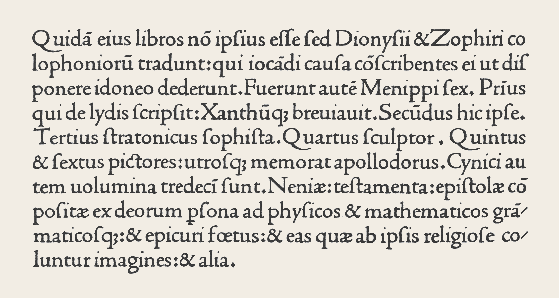
Typefaces have been relatively stable since the late 15th century, actually. Here's a sample of typesetting from that era (Supposedly from Nicolas Jenson; seems correct but I can't verify outside Wikipedia).
The Gutenberg bible you're looking at was printed in a form of "Gothic" script or Blackletter, which had surges and wanes in popularity among printers in central Europe, particularly Germany, throughout the period of movable-type printing - from the 15th to the 19th centuries. Gothic scripts were used by printers all throughout Europe, until printers and punchcutters in Italy rediscovered the Carolingian Minuscule script and created the "Antiqua" script which is a typographical script based on it. Antiqua is the ancestor for all our book typefaces up to this day; it displaced Gothic script almost immediately in Italy and most of the rest of Europe, particularly Romance-speaking areas.
Different variations on the gothic script have been used up until the 20th century, when the Nazi regime made heavy use of them, and then banned them. Fraktur would never regain its popularity in Germany after the war, so that was the final nail in the coffin of common usage of the Gothic script.
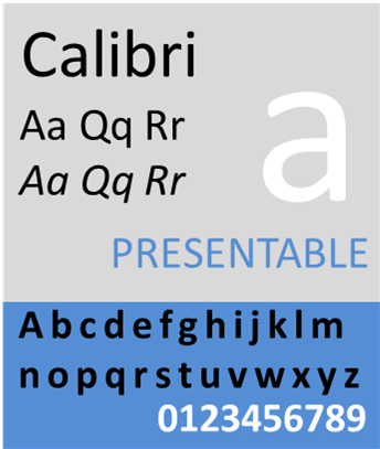
I have never seen Calibri used for books... most books are still set in a font that has serifs, i.e. little lines at the ends of the letters, and where the lines have different thickness -- a lot more complex than Calibri. Something similar to Times New Roman.
The changes are in part fashion and in part technology. Letters used for printing used to be cast from lead into forms cut out of wood. Imagine cutting letter shapes into wood... you would choose shapes that are easy to cut, and have lots of straight lines.
A counterexample is in fact Times New Roman: as the name says, it is based on a Roman typeface -- the capital letters look like the letters used by ancient Roman stone masons. So this particular style stayed pretty much unchanged for 2000 years.