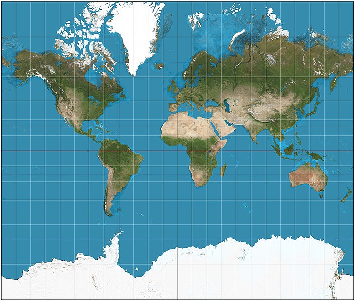
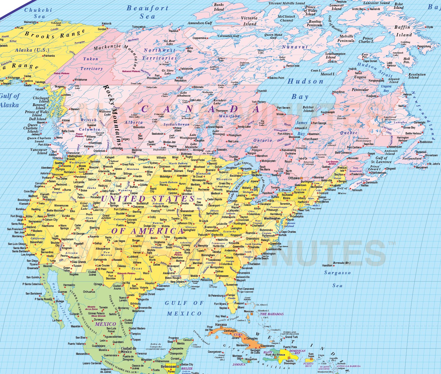
Whenever you make a map, you are also making a compromise. The Earth is round, a map is flat; you cannot accurately represent a sphere on a flat surface. There are several ways to work around that, mostly by manipulating the variables of size, shape, and direction. You bring up the Mercator projection, which sacrifices accurate size in favor of maintaining direction. No matter where you are on the map, north is up. This makes it great for navigating between two points; it was designed for sailors by a fellow from Flanders named Gerardus Mercator in 1569.This also makes it very useful for popular apps like Google Maps, which use a slightly modified version called "Web Mercator."
The map more often seen, in my experience, in textbooks and planners and the like is the Robinson projection, which averages compromises in size and direction instead of optimizing one or the other. "Compromise projections" like this or the Winkel Tripel projection are preferred by most cartographic and geographic authorities. But notice if you follow the longitude lines, they're not straight. North isn't always up, sometimes it's left or right and up. Now, it is easy to represent a small section of a sphere as a flat surface. If we're just mapping the nicely rectangular state of Colorado, we don't need to make many compromises to make it keep its right angles. But look at Colorado on a zoomed out Robinson projection. It's a parallelogram! Imagine zooming in and out on Google Maps if it used this projection. Either we would be sacrificing the opportunity for a better map and accurate directions by just zooming in on the Robinson and not adjusting, or we would have a Colorado that wiggled and changed shape as you zoomed in and out. Neither is useful, so we stick with Mercator for navigation.
You might be asking this from that "West Wing" clip that makes the rounds every so often about how the Mercator is unfairly biased by making third-world countries appear small and how the Gall-Peters equal-area projection is the saving grace of American schools. This is a debate that's been going on for a while. It popped up most heavily in the late '80s, but Americans have been talking about the inadequacies of the Mercator since the beginning of the century. There's a few reasons that's dumb:
Any map authority discourages all rectangular general purpose maps in favor of composite ones lie the Robinson. The earth has no right angles, so why should a map?
The Gall-Peters projection does, in fact, maintain equal areas for all points. But this comes at the cost of shape. Scandinavia appears twice as wide as it is tall, while Peru is about the same length as Chile. But some parts don't distoted terribly, those parts mostly being Western and Central Europe. So much for accurately representing third-world countries.
The Mercator was never meant as a general purpose map. Mercator himself didn't even use it as one. You don't need to slap claims of colonialism and third-world disenfranchisement to make the case that it's bad for that job. It's like protesting using a bike seat as an office chair because it encourages bad posture.