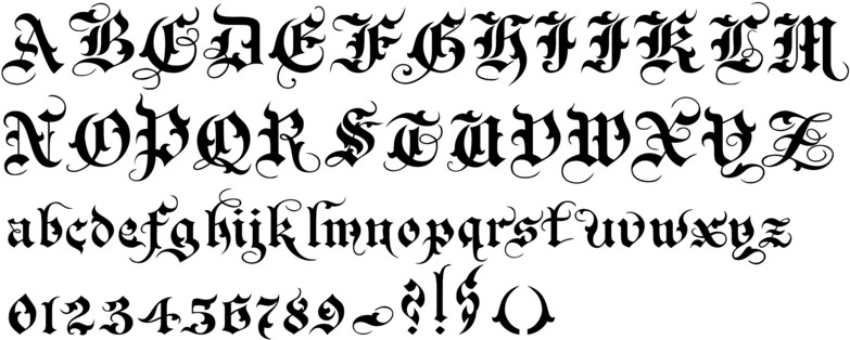
By Gothic I mean something like this. I'm vaguely aware it was favored by the Nazis for its 'Germanness', but why was that, and is there any connection to today's use in brands like Ecko and other kinds of streetwear? Is it possible it's connected through Punk culture and their use of the swastika in the 70s?
The font in question is usually referred to as Fraktur and its use in German print long predated the rise of Hitler and the NSDAP. In Imperial Germany, Fraktur was a popular style for both the avant garde Jugendstil movement and various cultural conservatives. In the latter case, the argument in favor of Fraktur was that it represented a truly Germanic font and its resemblance to handwriting connected the printed word to the great German thinkers of the past. Although it predominated a lot of print in the nineteenth century, Fraktur was far from hegemonic. Antiqua, also known as runden Schriften (rounded type), became increasingly popular for newspapers and other forms of mass media. Partisans of Antiqua argued that its style was easier to read and more psychologically in line with the mass machine age. These debates over fonts sharpened during the contentious Weimar period as partisans of each argued their font was the appropriate Nationalschrift (national lettering). By 1928, Fraktur had a slight edge in books published in it (57% vs. 43%) and lead in magazines (60% vs 40%), but Antiqua dominated billboards, advertisements, and newspapers by a commanding margin.
The rise of the NSDAP in 1933 greatly complicated matters concerning the issue over the Nationalschrift. Counter-intuitively, Hitler took a position against Fraktur despite its alleged connection to the German past and national distinctiveness. The NSDAP styled itself as a party of the modern era and that Fraktur represented a certain species of historical introspection that distracted Germany from achieving its destiny. But despite Hitler's judgements in favor of Antiqua, the state elected to make Fraktur the official font for its publications in 1933. This was due in no small measure to the proliferation of runden Schriften fonts (around 2500) by 1929. When caught between the issue of modernity and expediency, the National Socialists chose the latter. Ironically, the National Socialists also systematized the Fraktur font used by state publications into a block form that merged Fraktur with san-serif designs, a move in typography that had its origins in the climate of experimentation and "New Objectivity" of the Weimar Republic.
Yet the relationship of the Third Reich to Fraktur was far from stable. One argument against Fraktur was that it made it much harder for Volksdeutsche to read material produced within the Reich. These arguments gathered steam as the Third Reich expanded culminating in a 1941 Chancellery decree that Fraktur characters were Judenlettern (Jewish letters) and that all subsequent printing should be in an Antiqua-style font.
The 1941 decree helped to kill off Fraktur as a font for German printers in the postwar period. What further added to Fraktur's decline was the gradual abandonment by German schools of Sütterlin cursive writing that was very closely associated with Fraktur. Despite the 1941 decree, Fraktur became indelibly associated with the Third Reich, with its bold Fraktur fonts labeled as Schaftstiefelgrotesk (Jackboot Gothic Sans-serif) by many printers.
Sources
Eskilson, Stephen. Graphic Design: A New History. New Haven, Conn: Yale University Press, 2012.
Reuveni, Gideon. Reading Germany: Literature and Consumer Culture in Germany Before 1933. New York: Berghahn Books, 2006.