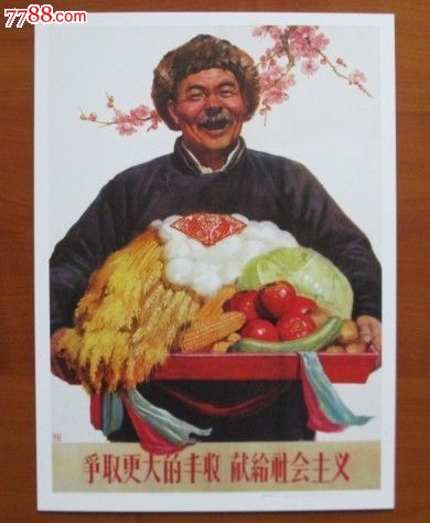
I noticed that most people featured in Chinese propaganda posters during Mao's era have thick or bushy eyebrows, like how everyone is blonde in Nazi propaganda poster. So are many North Korean posters.
I guess this symbolizes bravery and hard will, but is there any better historical or artistic explanation to this?
I think you're not focusing quite on the unifying feature or time period. Chinese propaganda posters converged in a particular style gradually from the late 1950s on and reached so, I suppose, apotheosis during the Cultural Revolution. Even during this time period there were individualized styles that varied from artist to artist, and after Mao's death things began to diverge once again.
The chronologically-set galleries on Chineseposters.net show the progression I'm talking about..
Note that the style is simplified compared to earlier or later works, and gestures became grandiose, hyperbolic, featuring less individual characters and less complex scenes and focusing more on easily identifiable facial gestures - hence the perceived focus on the eyes. I don't think any thorough study has been done as to why specifically this trend happened but I'd like to propose two contributing factors to this shift:
a) The most prolific propaganda poster painters of the day had already adopted this style.
The most prolific being two painters based on Shanghai - Qian Daxin 钱大昕 and Ha Qiongwen 哈琼文. Ha is the more famous of the two in China - his 1959 work Long Live Chairman Mao, which doesn't actually feature Chairman Mao at all shows many of the hallmarks - few characters, exaggerated emotions, and simple backgrounds. When the painting was displayed at the National Day celebrations in 1959 it was reprinted 2.5 million times. Qian's works are not as well known today but were also widely distributed in the late 50s and early 60s. His early works (this one is from 1953) already showed recognizable stylistic features, even if the composition itself didn't. By 1965 his style was far more formed and the subject matter simplified, a style which is reflected in Ha's work from 1966.
Shanghainese government actually has numbers of copies of each propaganda posters printed during this time period. While there were certainly more artists and some works were collaborations, between 1952 and 1957, 327000 copies were printed spread through 234 different posters. However, this one poster drawn by Qian in 1958 was printed 112500 times. For whatever it's worth, some Chinese commentators believe that the Shanghai style is a derivative of the western realism that was popular before the war in Shanghai and adapted to conform with Chairman Mao's 1942 directive that revolutionary art should depict the people and be widespread.
b) These paintings evolved and simplified because there was a need for local artists to reproduce in lieu of receiving prints
I have here a copy of a pamphlet published in 1959 by the Shanghai Fine Arts Publishing House called "How to Draw Propaganda Posters". It's in Chinese and the copy is of poor quality, and it only has one of the sample illustrations, so I'll try to translate some of it. It's effectively an instruction manual and a manifesto rolled into one.
Preface
"While propaganda posters had great effect, due to the current lack of professional painters, the number and quality of posters simply can't satisfy the needs of everyone, especially after the unveiling of the roadmap to establish socialism as factories, villages, military bases, offices and schools around the country all warmly supported the Great Leap Forward. . . To solve this issue, outside of the works of the professional artists, the efforts of amateur artists around the country must be enlisted to spread the word of the party far and wide and in various forms to each corner of the country."
Page 2
We believe that a propaganda poster that motivates and excites the viewer, outside of the painter's political enthusiasm and exposition skills, must also follow certain features unique to propaganda posters, such as strong lines, strong contrast in colors, and short but effective slogans. . . The painter must paint as if he's preparing for war. . . A good propaganda poster must sing loudly to the people from each corner, even if one does not pay close attention to the painting, it should still leave a deep impression. To achieve this goal, you must select common and easily understood situations and joyous crowds, or even the most well-intended work may not be accepted by the public."
Page 3
"We must avoid complicated scenarios or use oblique ways to portray a message, and avoid symbolisms that would not be commonly understood by everyone and instead focus on what's familiar to the common Chinese person and their sensibilities. The poster must appear familiar in front of the audience and become a trusted friend of the people... If you are using people to depict a theme, then the people should be archetypal, with strong emotions and clear motives in their actions. . . Unnecessary elements should not appear on the poster at all, as we want the poster to leave a lasting impression on the viewer. . . Propaganda posters are the most political form of art and the painter should have plenty of political enthusiasm and sharp analytical skills, combining both Marxist-Leninst policies and a deep appreciation for the small details in life."
Page 5
"It's difficult to say exactly what one should choose as the main character in each poster. However, it's certain that the painter must be familiar with this person. If you're a worker or a farmer, then you should already be prepared for this."
Page 11-12
"The layout should be especially clear. When executing the painting, not only should the scene be especially attractive, but you must choose the most powerful angle, and also use exaggeration and hyperbole as well as strong contrast in colors to make the character pop off the page, and a succinct and simple drawing is best to capture the attention. . . It should be easy for the audience to see from a distance what the picture depicts, focusing on the head of the character."
Page 22
"A propaganda poster must have bright and loud colors, without it the painting will not capture the audience's attention. Previously some posters used pastel colors but these posters were not well received."
So there's a fair amount of both ideological instruction as well as technical instruction but it seems like at least the Shanghai publishers had a comprehensive manifesto as to their look before 1959, and the later works do reflect many elements written about here.
I'm sure there are other factors that prompted a homogenization of styles but these are two of the most immediate factors I know of.
Can you link some examples?