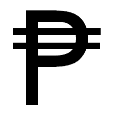
Edit: Sorry for the spelling mistake. I meant Peso, not Preso.
Examples like the:
all have a double bar through the symbol. Is there any historical reason for this? Or is it coincidence?
In most currency symbols, either one or two overlayed lines can be used with no difference in meaning. In most symbols where there is a choice, the version with two lines is the older form. But when two lines were used on a typewriter, there was a tendency for the spaces between the lines to become filled with with typewriter ribbon lint and ink and so the one-line version became more common on typewriters and from that in many printer fonts.