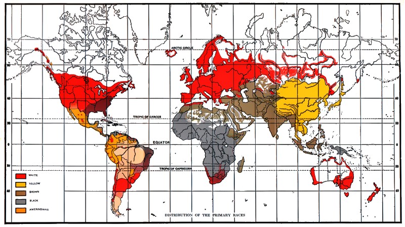
When we look at old world maps from the age of discovery and the colonial era, they are approximations with a lot of the landmasses distorted/incorrect-looking
For example, this 1798 map: https://commons.wikimedia.org/wiki/File:1798_Payne_Map_of_the_World_%28pre_1800_American_Map%29_-Geographicus-_World-payne-1798.jpg
And this 1920 map: https://upload.wikimedia.org/wikipedia/commons/2/21/Stoddard_race_map_1920.jpg
Very different, 1920s map looks indistinguishable from a modern map. So I am guessing that such indistinguishable maps came around in the 19th century. Does anyone know pecisely when?
Hi! Hopefully one of the cartography historians can drop by with a targeted answer for you, but meanwhile, you may be interested in flipping through the posts in the FAQ: there are many questions asking about maps at various times, and especially about improving accuracy
The posts have been archived by now, so if you have follow-up questions for any of the users, just ask here and tag their username to notify them
Not an answer to your question, but part of the difference between your two maps is that they use two different projections. Here is a map from 1800, using the same Mercator projection that your 1920 map uses. As you can see they're far more similar. They've also included the, then, recent discovery that Tasmania and Australia are not connected.