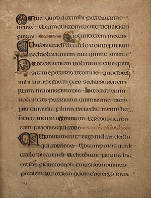
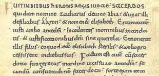
Where did these aesthetics come from? What's the deeper meaning behind them? To me it seems far too complicated to write like that, especially if you are a medieval monk writing whole books like this in a dark monastery room.
The Middle Ages spanned roughly a millennium, during all of which at least some people in western Europe were writing. In this time, numerous forms of script enjoyed their heyday, passed out of fashion, and in some cases were revived. Different scripts were used for different purposes in the same time frame, and over time we can actually trace the evolution of one script into another. Letter writing and book sharing among monastic communities allowed hands to more or less standardize across the Latin west, although scholars can trace regional differences down to individual monasteries.
The first distinction is between cursive (course-ive--it runs a course, fast) which is meant to be used in more casual situations when you have to write faster. You can see the difference between Roman cursive and Roman square capitals. Then uncial, which is probably what you think of as "Irish" script due to its use in the Book of Kells, evolved out of the curviness of Roman cursive but more legible.
Scribes of the Carolingian renaissance thought that the wide, majiscule letters of uncial took up too much space on the page. They promoted what we call "Carolingian miniscule" as a way to standardize books across the West. Carolingian miniscule also references Roman capitals, to some extent, fitting in with the classicizing goals of Charlemagne's court scholars. There are still plenty of charters at the time written in spidery Merovingian scrawl, though.
Carolingian miniscule evolves over the next couple of centuries, of course. By the 12th century, it's still pretty recognizable but we see the signs of the coming evolution into Gothic scripts (12C writing is called proto-Gothic). You can see how it looks kind of like Carolingian, but spikier.
You asked this question probably thinking about Gothic textualis. This is one form of the Gothic scripts that dominate late medieval book production. Textualis was used for fancy display books. On one hand, it was meant to be ornate and beautiful. On the other, it was meant for the letters to take up less space on the page, to allow for more illustration, bigger letters, fewer pages in a prohibitively expensive book. (Even with the introduction of paper, luxury books continued to use vastly more expensive parchment). But there was also Gothic cursiva (in a rather legible example, here) for faster writing needs.
In the late 15th and 16th centuries, humanist scholars wanted to revive The Classics of ancient Rome and Greece. As part of this revival, they adopted the style of handwriting in the classical texts they re-discovered as their own humanist miniscule. (Which itself had several forms: a book hand for display purposes, a secretary hand for bureacrats who needed to write more, faster, and so forth). If that looks familiar, well, you're not wrong. The texts they rediscovered may have been written in antiquity, but the books had largely been copied by Carolingian monks. And so the humanists of 1420 Italy revived a hand from the era they despised.
I stress that none of these changes are overnight or totalizing. There is plenty of illegible secretary and normal-person-in-medieval-city handwriting in the era of humanist miniscule (alas). But those are some of the broad-scale changes in medieval paleography, with a little bit of explanation that stretches beyond "because people liked it."