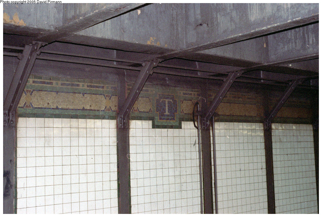
There are mosaics in Times Square Station that look a lot like Confederate flags. This HistoryNet post suggests that the designer, Squire J. Vickers, had reason to refer to and/or have sympathies towards the Confederacy.
The blog post posits: "Vickers also unmistakably references the symbol of the South to highlight the station’s proximity to a publisher with strong ties to the South: New York Times owner Adolph S. Ochs."
Is this a valid or reasonably arguable statement?
The HistoryNet post didn't seem to have particularly strong evidence but, you know, I'm not a historian!
The stations on the IRT (1/2/3) lines south of the original 1904 subway connection were built as part of the Dual Contracts system, which was an agreement between the Interborough Rapid Transit Company (IRT) and Brooklyn Rapid Transit Company (BRT, later the Brooklyn-Manhattan Transit Corporation, the BMT) to build and operate new lines and stations. The original 28 stations did have distinctive designs and paint schemes, so that commuters could glance up from their newspapers and know where they were in the system. This tradition was referenced in the new stations, although they were not quite as ornate as the other ones (Vickers believed in straightforward and simple ornamentation). Some of the stations had decorative mosaics that recalled the history of the area, such as Chambers Street, which has a depiction of King’s College (Columbia), which was once located nearby (Canal Street on the BMT lines has a lovely mosaic of the old Broadway Bridge). Most of the stations included small mosaics with either a number or initial within a hexagon, surrounded by two triangles with a diamond over them on either side. This pattern appears in the name bands on the side of the platforms, as well as in the station mezzanines, and each station has its own color scheme. The band on the side walls at Times Square have a T in the hexagon, and the triangle/diamond pattern, which can be seen here. The colors include yellow, red, blue, white, and green tiles.
Considering that Vickers was known for his meticulous attention to detail, I think that it is highly likely that the original pattern would have been followed on the southern mezzanine, as this was carried out in the other stations to the south of this point (to the north are the 1904 stations). The original mezzanine had stairs, and they exited on the northern side of the street onto the sidewalk. At some point, that entrance was closed, and a new entrance was made on the southern side of the street between buildings. The old pattern may have been destroyed at this point, and replaced with this newer pattern (which is the pattern in question). It is feasible that the contractor who was hired to do the tile and mosaic work tried to imitate the original pattern, and in doing so wound up changing it (there is no yellow diamond, and there is extra red and white tiling on the sides, but it follows the color pattern of the old tiles). There may have indeed been a nod to the status of Times Square as the “crossroads of the world” in the pattern, but I have not found any evidence that it was directly inspired by the Confederate flag.