Particularly the old maps of the Americas for instance. Did people literally sail on ships along the coast and use a compass to map every directional change as they sailed? It was there a bit of artistic license going on?
Taken and adapted from an earlier answer of mine. It will be slightly general at first, but towards the end I will address the specific questions:
I can give a more detailed answer focusing on portolan charts being made from 13th to 16th century (and beyond). Those were the maps used in sailing and navigating - the ones explorers would use and make. I must mention there were also other type of maps at the time, the so called mappa mundi or worldmaps, and in 15th century we have new maps appearing done in Ptolemaic style rediscovered with translation of Ptolemy's Geographia into Latin. Both of those were different types of maps made in a distinctly different way, and I won't be covering them here, but focus only on these sailing portolan charts.
At the time we are talking about sailing maps were not made by longitudes and latitudes. Measuring longitude was a major problem that wasn't solved till well into 18th century. But latitude also wasn't purely trivial and wasn't measured in connection to ship navigation until second half of 15th century. First maps that actually had latitude information on them appeared only since 1500. Yet sailing charts depicting coasts of Europe and Mediterranean existed since the late 13th century. Those maps- the portolan charts - were showing coastal and sailing information and they were based on classifying two points in space by compass directions and distances between them. Here is a typical portolan chart, this one coming most likely from 1470s. They were usually drawn on vellum, but were also done on paper and other medium. They are easily recognizable by the web of so called rhumb lines on them. While at first look they seem chaotic, they actually form a circle of 16-24 intersecting points and one center intersection. It is most likely that the rhumb lines were drawn before adding the coastal features as we guess from having examples of empty charts with drawn rhumblines likely prepared for filling in but never completed.
The maps were actually surprisingly accurate considering how much estimation and rounding the process of charting involved. Sailors had to accurately determine the compass direction ship was heading and then judge the distance passed. As there wasn't a reliable way to measure ship speed back then, it was done by either estimating (guessing) the speed and measuring time passed with days or hours measured by hourglasses; or (later) by dropping simple floating log from the front of the ship, and counting how long it takes to pass the ship. Overall all of it was unavoidably inaccurate. And the effects of magnetic declination making even the compass directions unreliable and everything became even more a mess.
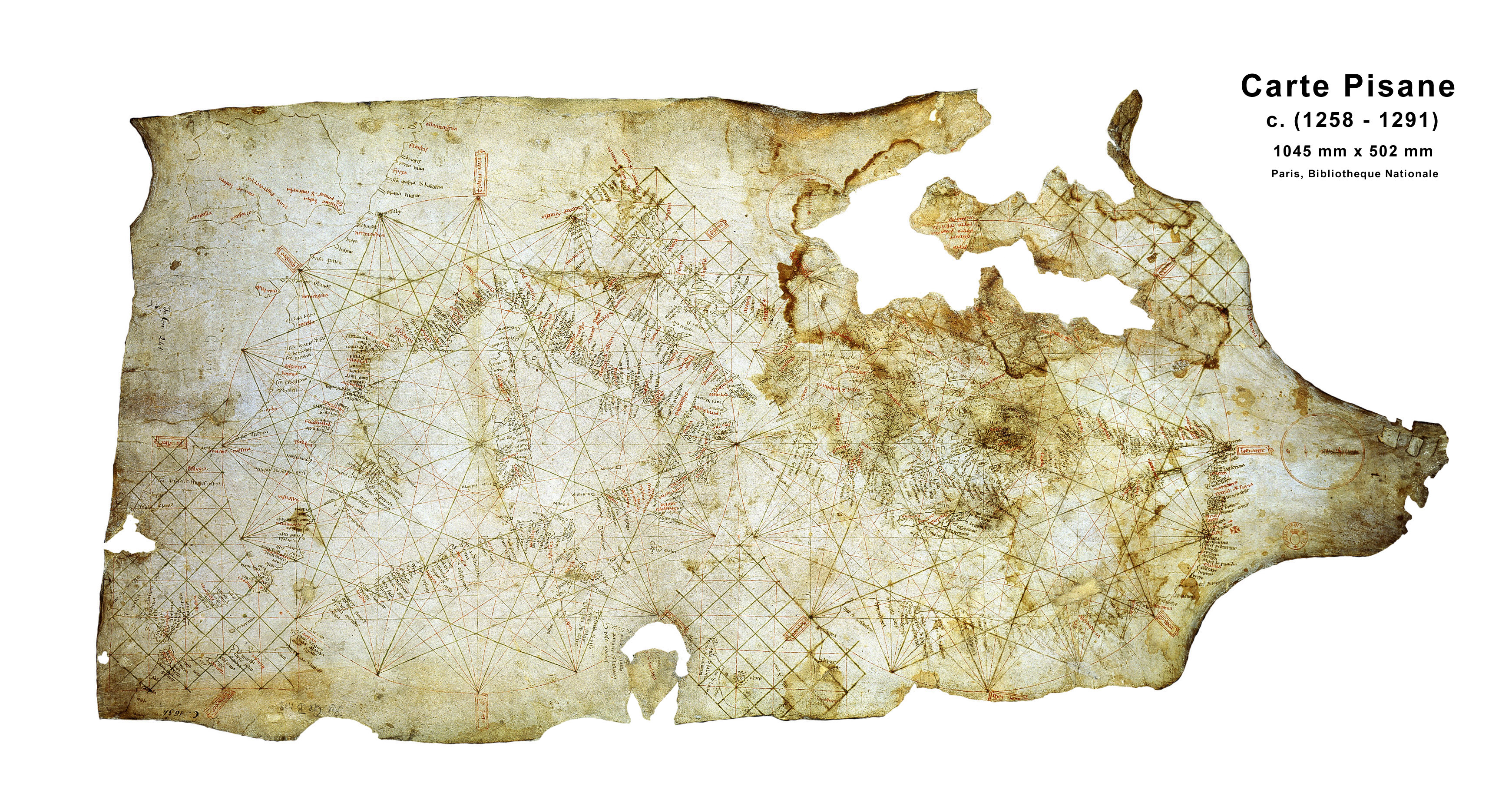
Still, as I said, the results were quite surprisingly accurate. The maps were also continuously updated, with new data added and old wrong data corrected. Here is the earliest known portolan chart, Carta Pisana of 13th century and one Catalan atlas of 14th century. which has many corrections and resembles the real coast much more accurately (with many major and minor mistakes though). Interestingly these charts, while not really corresponding to the latitudes and longitudes due to magnetic declination, were in fact completely accurate for compass bearings as long as magnetic declination was the same (it changed through time). Following that chart, despite not looking like satellite image, would bring you to your desired location.
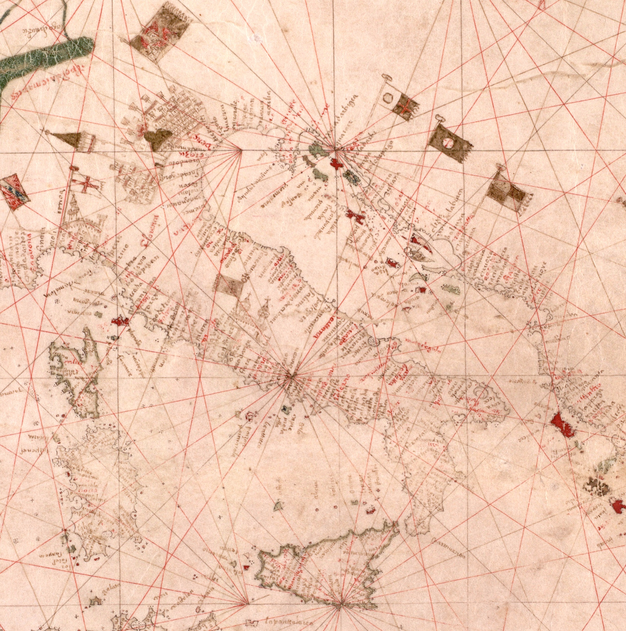
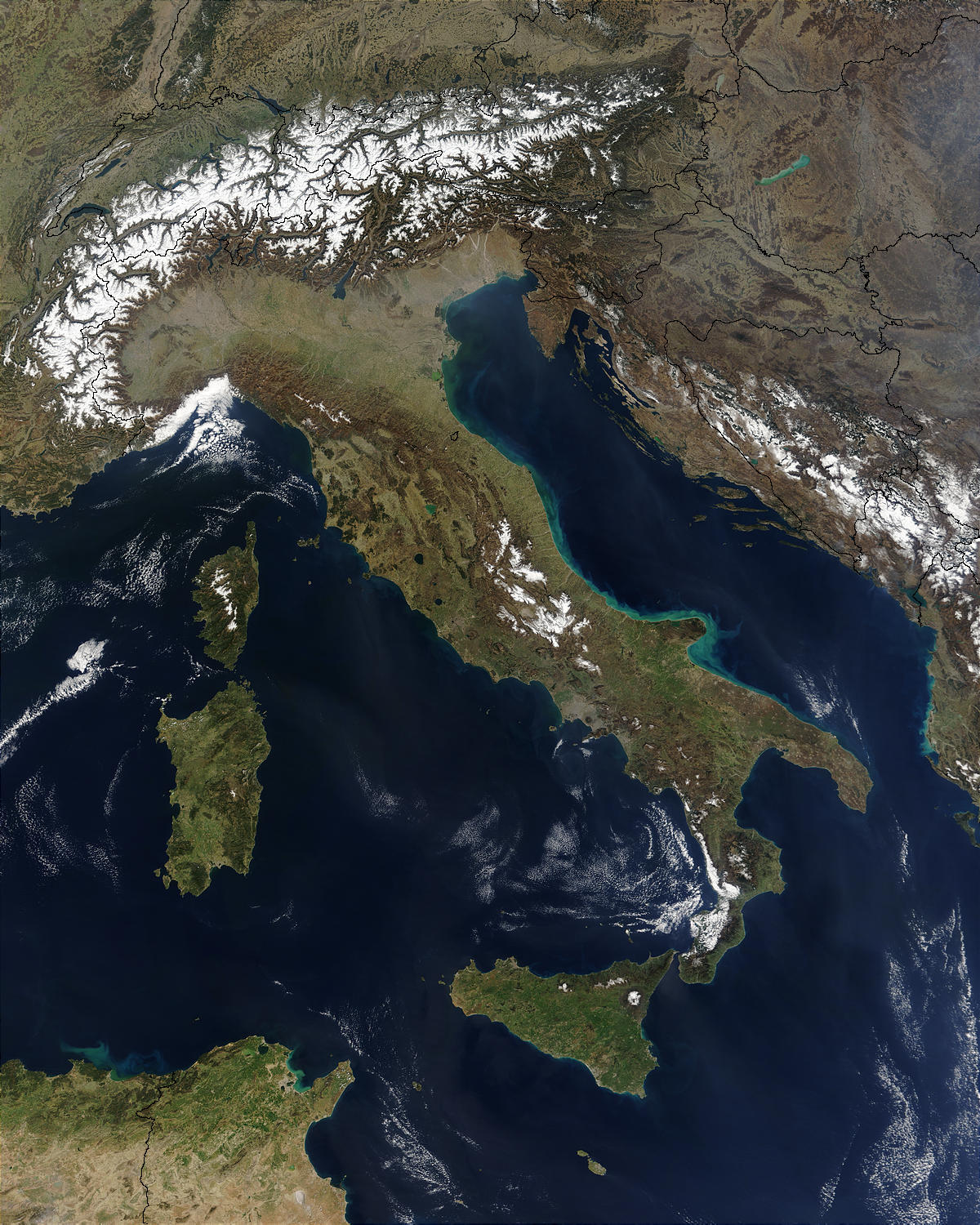
However, we should keep in mind that these maps were not accurate, nor were they intended to be. On the contrary, these maps have purposefully enlarged bays, islands and river mouths, as existence of those features was more important to a mariner than the exact shape and size. To provide an example, check this 15th century portolan chart of Italy and Adriatic sea with modern satellite image of the same area. We can easily see the portolan chart's enlarged coastal features which make the coast appear much more thorny and edgy, which is not really present in reality to such an extent where the coast is relatively smooth.
Now so far I only talked theoretically and in rough overview. Let's focus on early explorers and their map making methods. We will examine two works of the period, first Duarte Pacheco Pereira's Esmeraldo De Situ Orbis and The Book of Francisco Rodrigues, both which are books on navigational matters and are dated to first decades of 1500s.
Looking at these two works we see that using portolan charts was only one of the methods used by navigators to see determine where they are going, and one possibly of secondary importance compared to the main way of passing information: verbal description, either orally or in written form. Duarte Pacheco Pereira's Esmeraldo is full of such descriptions and here is a random quote of such passages:
By standing four leagues out to sea and sailing 15 leagues SE from Rio dos Barbaciis, you will come to the mouth of Rio de Guambea. The country from the Barbaciis to the Guambea is very low and woody, and the sea has many rocks and sand shallows and at ten fathoms one is four leagues from land and cannot see it owing to its lowness. This country, extending to the said Rio de Guambea, is called Gibandor ; it has a very large bay which on the SE forms a point running far into the sea. On this point there is a very large palm forest which covers two leagues or more, and out at sea a league from this point is a shallow of rock and sand which is called the shallow of Santa Maria, with not more than a fathom of water over it ; it is very dangerous and some ships have been wrecked there. This river is 1° 5' north of the equator. High tide flows NW and SE. Half a league to the N of this palm forest is the mouth of the river at the present time, and he who enters it must sail E by S and in the deepest part he will find two and a half fathoms at low tide and three and a half at full
A lot of information is given here, from compass directions and distances, as well as latitudes, but also all plethora of different details necessary for navigation, like descriptions of coasts and rivers, locations of shallows and rocks, tide times, depths of sea etc.
This verbal description was complemented with visual images, which we can divide into two large groups: charts of smaller/larger areas; and images of the coast as seen from the ship. The former would be charts like above but just of parts of the coast; the latter would depict key locations so the navigator can identify them and know how to proceed especially if they have some tricky approach. Sadly, the images from Duarte Pacheco Pereira's book were lost in history and we only have his textual description, but we do have the images from Francisco Rodrigues book.
Francisco Rodrigues was a pilot, often praised for his cartographic skills, who was present with the Portuguese in their first voyages through SE Asia (Indonesia). In those voyages, he charted for them new islands and luckily his images were preserved together with his book.
Here are two different examples of the charts, and here are two visual images of the coast, made to help identify the key coast points. For those interested, I collected the rest of the images in this album. from the work linked above.
The two people I mention here, Duarte Pacheco Pereira and Francisco Rodrigues were highly skilled in drawing and cartography, and probably not representative of the average pilot. But from them we can see how the procedure of charting would look like. The pilots would usually note all the information necessary - directions, distances, depth, tides, coast characteristic. They would also note the latitudes of the places, but at this point in time this measurement would usually be made on land which was much more accurate then measuring latitude on sea in a rocking ship. If they had the skill the pilots would draw smaller charts of the coast themselves, made pretty much purely by eyesight observations from the deck. If they didn't, specially trained cartographers might draw it from their notes. Later, makers of larger portolan charts would compile info from these smaller charts into larger charts. Other mapmakers would copy their maps, and add corrections if they know of any. And we would have maps.