I was browsing through a Wikipedia article today when I stumbled across this image: https://commons.m.wikimedia.org/wiki/File:Hecataeus_world_map-en.svg#mw-jump-to-license (Sorry mobile)
It got me thinking, this is a somewhat accurate depiction of the Mediterranean area, even if the other parts are lacking in detail. Would it be possible to combine maps of different cultures across Earth into one map that might give us a more accurate representation of geography hundreds of years before an individual nation could make this type of map? If not using ancient maps, such as this reconstruction, what era might allow for this?
I understand much of the Americas will not be represented and large swaths of land in the old world won't either, but I just wonder if the sum of humanity could build a better map than just one nation.
That's pretty much what Ptolemy actually did!
I'd better clarify that the map you linked to is not ancient. It is completely fabricated. Take a look at the source info ('Own work'). It is based on a web page by Jona Lendering, but it's absolutely misleadingly labelled there: it isn't a map that Hecataeus made, it's a map of places that appeared in Hecataeus' ethnography. There's nothing to suggest Hecataeus made any kind of pictorial map.
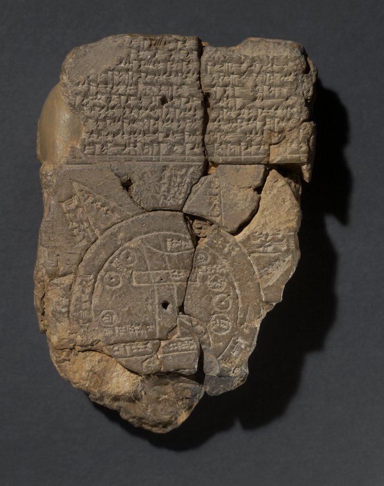
Actual examples of maps of that era would look like this (an actual Babylonian map) or this (a modern-era reimagination of Anaximander's map). They're schematic representations of the relationship between continents -- not even islands, continents: bodies of that scale. There's no detail of the kind you were hoping for. Even maps made a millennium later, like the Peutinger map, bear little resemblance to the modern photorealistic style of map: the Peutinger map is more in the vein of a metro-map, with information about routes and stops, rather than geography as such.
The most photo-realistic style of map that we get from antiquity is in Ptolemy's Geography, which plots all its locations by latitude and longitude. No pictorial version survives, but Ptolemy gives full information about how to construct one: here's a rendition of his data by Hans van Deukeren, which was hosted on a website that has now sadly gone offline. As with the fake one that you found, you'll see that the Mediterranean is relatively accurate.
But Ptolemy's map is already the product of taking maps and surveying data from many different regions and compiling it all into one map -- exactly what you suggested in your question.
This was demonstrated in a 2013 article which indicated that different parts of the Mediterranean world had their longitude data calculated from multiple different meridians. Now, you may be aware that, while latitude is easy to measure (and was easy in antiquity too), longitude is much much harder. The problem of measuring longitude accurately wasn't solved until the modern era. In Ptolemy's day, longitude had to be inferred from land-based surveys of the physical distance between places. Ancient surveying wasn't nearly accurate enough to produce good measurements of east-west separation between places.
Moreover, that method of calculating longitude depended on an accurate measure of the size of the earth, and Ptolemy used two figures for the earth's circumference, 180,000 and 252,000 stadia -- 33,300 km and 46,620 km. The true figure for the equatorial circumference is 40,070 km, so his figures were 20% too low and 16% too high. That means that the errors in the already-imprecise measurements of longitude from surveying were put further off by the same proportions.
The 2013 article indicated that multiple meridians were used, and also that both figures for the earth's circumference got used. The result is that Ptolemy's longitude data are ... distorted. Here's an image from the article showing Ptolemy's longitude data for Spain and France, superimposed over an accurate map: the black and white circles indicate the accurate positions of the various sites, the red ones indicate Ptolemy's data based on the Rome meridian, and the yellow circles indicate locations based on the Rome meridian but using the 252,000 stadia figure.
The article is a hell of a read, but also -- fair warning -- very confusing. And that isn't the authors' fault! It's because it's just a fundamentally confusing topic.