I apologize if this is the wrong place, but I didn’t know where else to post this, and this question has really been bugging me. If you look at a map, Russia has this weird shape that shows the top middle of the country is at a more northern point than the Chukotka Oblast (Far East Russia), when in reality, that’s not the shape of it. Why do maps do this?
The problem with maps is that they are 2-dimensional flat things, while the surface of the earth is curved. Projecting that curved surface onto a flat map means that there will be some distortion of shape. Look at Russia on a globe, and look at Russia on a flat map, and they can look quite different.
Looking at a map of Russia with a projection designed to preserve the shape as much as possible:
Russia does indeed look somewhat banana-like, with a low middle and high ends. Compared to this projection, the common Mercator projection pushed middle Russia up into a big hump:
However, while this isn't the shape of the country as seen on a globe, or from space, or similar, it doesn't lie about which part of Russia is most northern. The northern-most part of mainland Russia is in the middle, Cape Chelyuskin. It's marked by the middle star of the top three stars on this map:
While Russia is banana-shaped, it's quite possible for the middle part to be closer to the North Pole, i.e., further north, than the ends of the banana, even if they look "higher" on a map. Consider this banana and a cross marking a "North Pole":
The "lower" middle of the banana is closer to the pole, and therefore further north, than the ends.
If we look at a map of banana-shaped Russia where were can see the location of the North Pole,
just off the top of the map, we can see that the coast of middle Russia is more northern than eastern Russia (and western Russia).
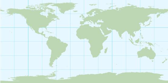
Since we use latitude and longitude to describe the positions of places on earth, a projection uses a linear scale for degrees longitude horizontally and degrees latitude vertically is simple. However, this distorts shapes as you move toward the poles:
This projection is a called a Cassini projection, and also various other names. This distorts sizes as well as shapes - it projects equal angles of longitude as equal distances, while in reality, a degree of longitude becomes shorter as we move north and south from the equator, by a factor of about sin(latitude). There are projections that preserve area, by shrinking the north-south distance as we move north or south from the equator on the map, but this is at the cost of distorting the shape even more.
The Mercator projection preserves shape better than those projections, by expanding the north-south scale as you move away from the equator. Locally, this preserves shapes, and more importantly, directions. On a Mercator projection, NE is always at an angle of 45 degrees - a useful thing for navigation. Unlike the projections that preserve the shape of Russia better (i.e., more banana-like), north is always straight up, and the most northern part of Russia is highest on the map. On a Mercator projection, shape is preserved locally, and as we move to larger areas where the curvature of the earth matters, shapes are distorted.
For more on cartographic projections, see https://kartoweb.itc.nl/geometrics/Map%20projections/mappro.html
_-_only_Crimea_disputed.svg)