There is a range of distinctly 'western' fonts. Fonts that when you see them, immediately make you think of bounty or rodeo show posters.
They are not all the same, but generally they are quite bold with even broader serifs.
How did this develop? Were the printing presses on the western frontier somehow special, or was it a design choice only? Was it a font that was used for stuff that had to be readable from a distance all over the US and only later became associated with western?
First, I need to offer the obligatory "not a historian" caveat – I am a type enthusiast with what I hope is a reasonably erudite understanding of the history of typography, but I am not nor will claim to be a type historian.
I will here attempt to answer the question as to why this kind of bold, condensed slab serif wood type (don't worry, I'll explain the terminology later) became popular in the vernacular printing of the United States in the mid-nineteenth century, including in the West. The second implied part of the question – why this style remains connected to the Old West in the popular imaginary to this day – I will leave unanswered, as it requires a knowledge of early 20th-century popular culture that I don't feel qualified to speculate in.
Type design, like many cultural phenomena, is intimately connected to both the technological and material conditions and the intellectual climate of its day. During the enlightenment, for instance, advances in printing meant finer lines could be consistently produced, while the intellectual striving for classical perfection and rationality led to attempts to find logical, geometric ways to construct type. In the late 17th century, Louis XIV in France commissioned the Romain du Roi, an only partially successful attempt to derive the shapes of letters from basic geometric forms. At the turn of the 19th century in revolutionary France these same principles would reach an apex in the type foundries of Giambattista Bodoni and Firmin Didot, who produced what today is called Didone type (a portmanteau of both their names) – type with geometric appearance, completely vertical stress, very thin hairlines and unbracketed serifs.
As the nineteenth century progressed, fashions turned away from the rational classicism of the preceding period across many artforms, and type design is no exception. As before, technological advancements are intimately connected to this. While Didones remained an important style in books for many decades to come, the vastly most printed new medium of the period was the popular newspaper. Starting in the 1810s, new presses became increasingly able to quickly and cheaply produce newsprint, and by the 1830s mass circulation "penny newspapers" became the norm. In the 1840s, the previously costly textile-based paper was replaced by wood-pulp paper which was cheaper and easier to make. Newspaper popularity exploded.
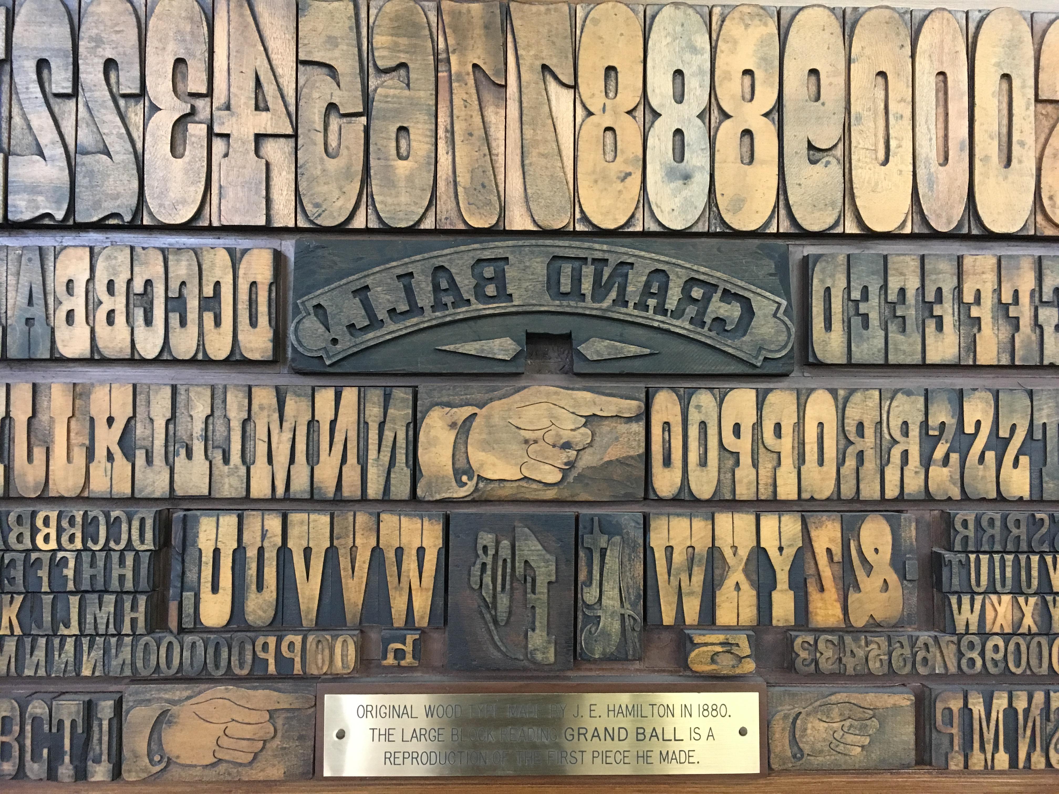
Another advancement (especially important for the "Western" style we're discussing) is the ability to cheaply mass-produce wood type. Wood, of course, was the material of the very earliest printing presses, going back to 9th-century China, but the cheapness and simplicity of cast lead type had reduced it to niche applications by the time printing became mainstream in Europe, like very large letters, where they held up better than lead. As printing large paper became cheaper and easier, demand rose for more and more large-print headlines, broadsides and posters, and in 1827 New York inventor Darius Wells invented a routing machine that could create new woodblock type at vastly faster speeds than before. Large-print, bold posters grew considerably more common.
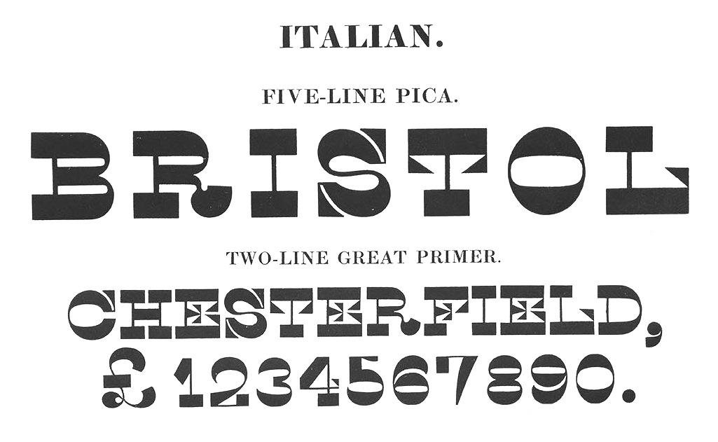
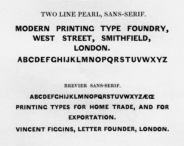
Combined with this technological advancement came a huge creative explosion of typography. No other period is considered to have produced more typeface innovation and new ideas as the first half of the 19th century, as foundries competed with each other to be the most visible on posters and in newspapers advertising. Completely new ways of creating letterforms spread quickly. Some derived from earlier styles, like the fat face, an extreme version of the Didone, while others were completely out there and experimental, like the "Italian" of founder Henry Caslon that reversed the thick and thin part of letters for truly interesting effect. Two new styles with rather more staying power was the sans serif, which removed serifs entirely, and the slab serif, or "Egyptian", where the previously hairline serifs of Didones grew wider and more pronounced, with squared-off ends. Some were straight and geometric, some were bracketed ("Clarendon"), but they all had the thick serifs in common.
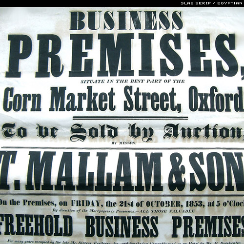
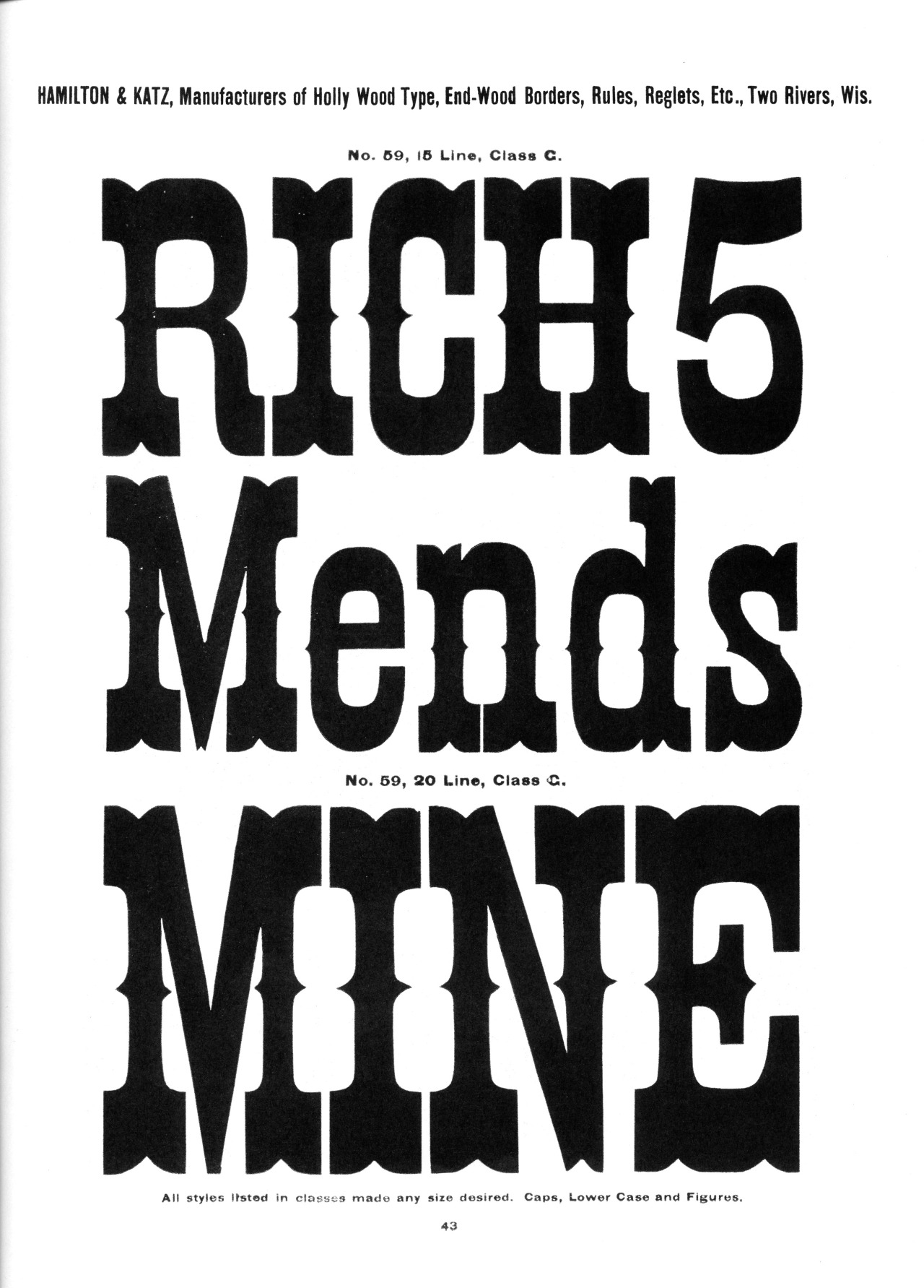
The new routed wood type, where thin lines are not ideal and where it's easier to cut using brackets, quickly took to the Egyptian style. It was large, bold, noticeable and (unlike fat face) it could be made extremely condensed to cram the maximum amount of information into each line, creating what's sometimes called a "French Clarendon". The style became prevalent on the largest spots on playbills and posters, where it really stands out among the often busy typographic style of the time. (Other styles sometimes associated with "Western" typefaces, like the middle spur or the bifurcated "Tuscan" serif, both seen here, have similar origins.)
So the condensed slab serif being used on 19th century posters was certainly both prevalent and noticeable, and newly cheap wood type would be all over the US at the time. And you do see it all the time on Wanted posters of the period, together with sans-serif, Tuscan serifs and other innovative type of the time.
Sources:
Bringhurst, Robert, The Elements of Typographic Style, 2nd ed, Vancouver: Hartley & Marks 2002
Shields, David, What is Wood Type?, retrieved from the website of the Hamilton Wood Type Museum
Edit: Small addendum about the alternative Clarendon/French Clarendon terminology.