The United Fruit Company was a corporation that - to oversimplify and understate - caused much political instability in 20th century Central America in order to secure its bananas. Its logo, from what I can find, was a black and white rifle on a yellow backdrop, with what looks like red smoke coming from the barrel that forms the word "Bananas".
This feels weirdly on-the-nose for a company that behaved as United Fruit had, as if advertising the means through which it secured its banana plantations. However, I doubt the general public would have been keen on the idea of such political instability for something as simple as bananas; let alone see it as a selling point. Why did the United Fruit Company choose this as their logo? What was it supposed to represent? For what reason did they think that it would help them sell?
I'm not able to find any credible evidence that the logo you provided was actually their logo at any point - it seems very likely that it was created in modern times as satire.
The oldest instance of that image that I was able to find is contained within this NYT article, and that article credits "Wink" with the image, which seems unnecessary if it were simply the logo of a defunct company. It's more likely that Wink is an artist who created the fictional logo (either for NYT or beforehand). Most of the incidences of that logo appearing on the web (including its appearance in the Wikipedia article) lead back to the NYT article from 2008.
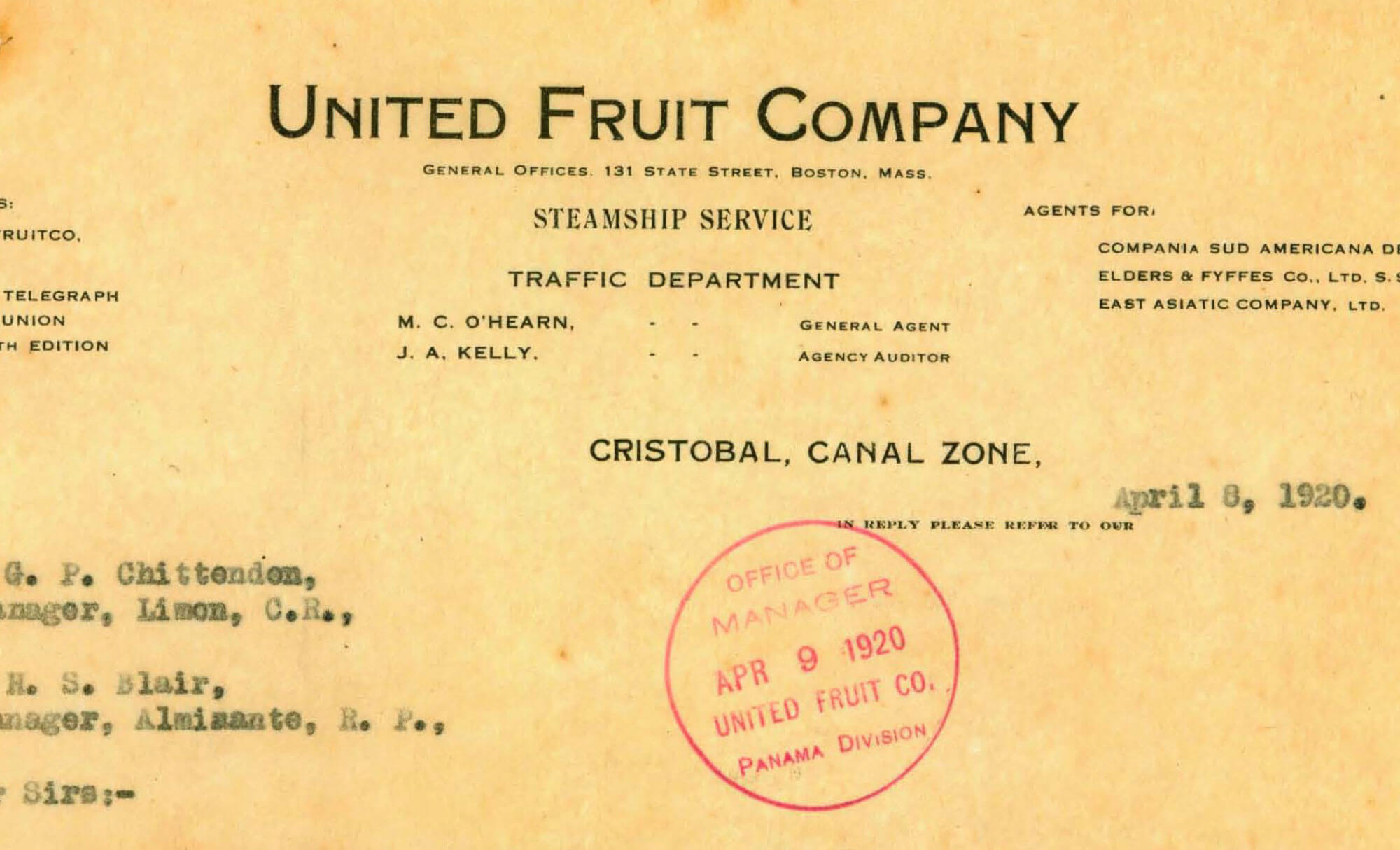
Looking at actual advertisements from magazines in the 1920's, it appears that the company's "logo" was originally just a stylized text saying "United Fruit Company". Bear in mind that the concept of a logo as we know it today only started to become popular in the late 1800's, and there were plenty of companies without a true logo well into the mid 1900's.
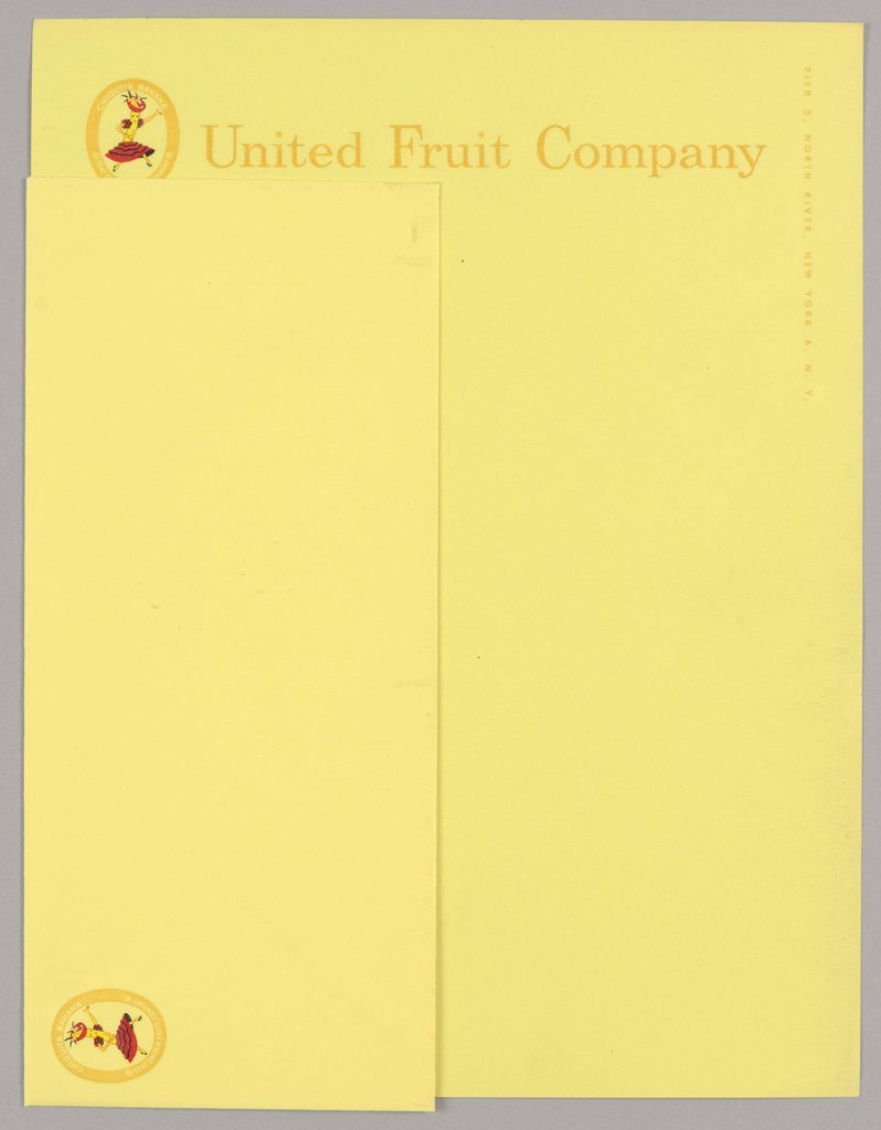
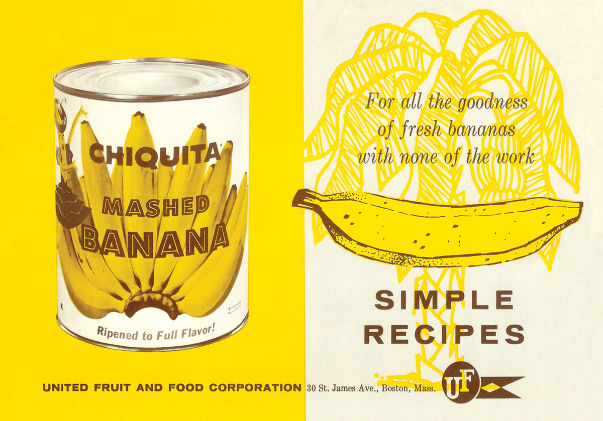
Various documents from 1920 through the mid-1940's do not depict a logo beyond the stylized text. The brand name "Chiquita" was trademarked in 1947, and a letter dated from that year depicts the early Chiquita brand logo. Shortly thereafter, magazine ads depict a United Fruit Co. banner featuring the Chiquita logo within it. By the 1950's, the United Fruit logo was reduced to a simple flag containing the letters UF as the Chiquita brand name started to take prominence in their advertisements (and indeed the entire company would undergo restructuring in the 1970's-1980's to eventually become Chiquita Brands International).
I have done my best to locate the true source of the satirical logo you provided but have fallen short - perhaps someone else can assist with that.
Update: /u/Cedric_Hampton has identified "Wink" as a well-known design firm out of Minneapolis. It appears the mystery is solved and we can conclusively state that the logo is indeed a modern satire.